Berkeley Community Acupuncture
Branding Identity, Squarespace Web Development & Design
Project Overview
Berkeley Community Acupuncture is a leader in the field of community-administered Traditional Chinese Medicine. Established in 2007, BCA is Berkeley’s first community acupuncture clinic. They have a vibrant community and a solid reputation, but their branding look and feel needed a refresh.
BCA approached us to help them clarify their organizational mission, and then integrate that into their overall messaging.
Their website, promotional materials, product packaging, and other branded materials felt inconsistent and detached from one another, and ultimately out of alignment with their organizational vision and values.
We started by working with the BCA team to assess their messaging goals. Seeing as how BCA has been around for a decade, their messaging goals had understandably shifted and evolved.
Then, we worked to identify and solidify their unique brand values. What does BCA hold dear? Why does BCA do what they do? What does BCA mean to its community?
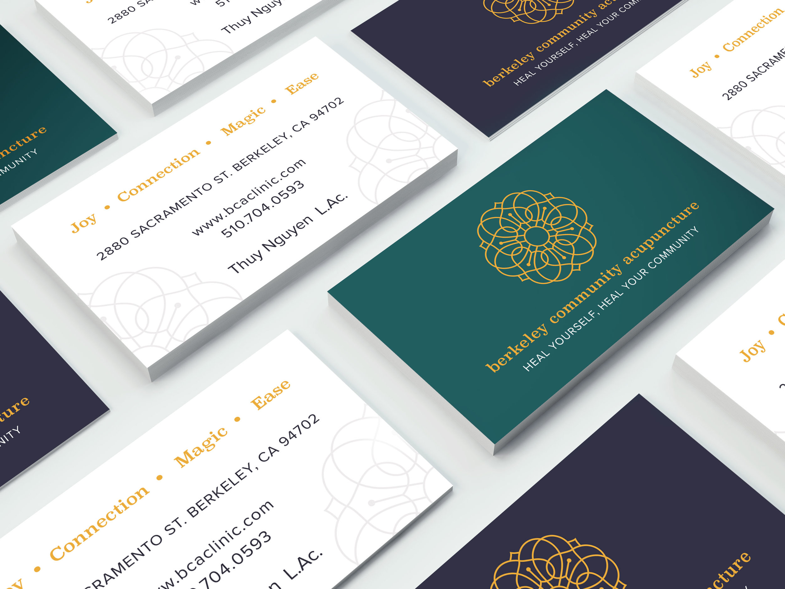
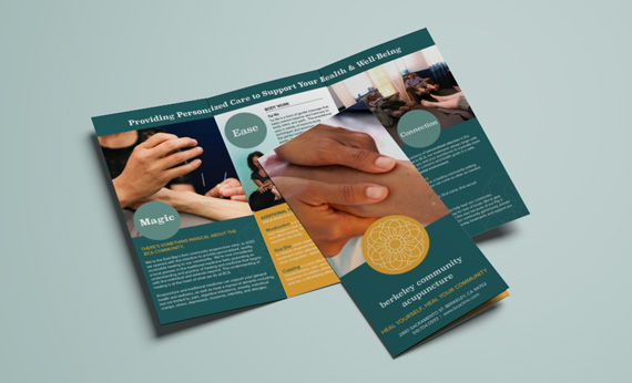
We ended up creating four foundational tenets that are the essence of the BCA brand: Joy, Connection, Ease, and Magic. These tenets serve as a compass for BCA to use to maintain clear and consistent brand voice and visuals.
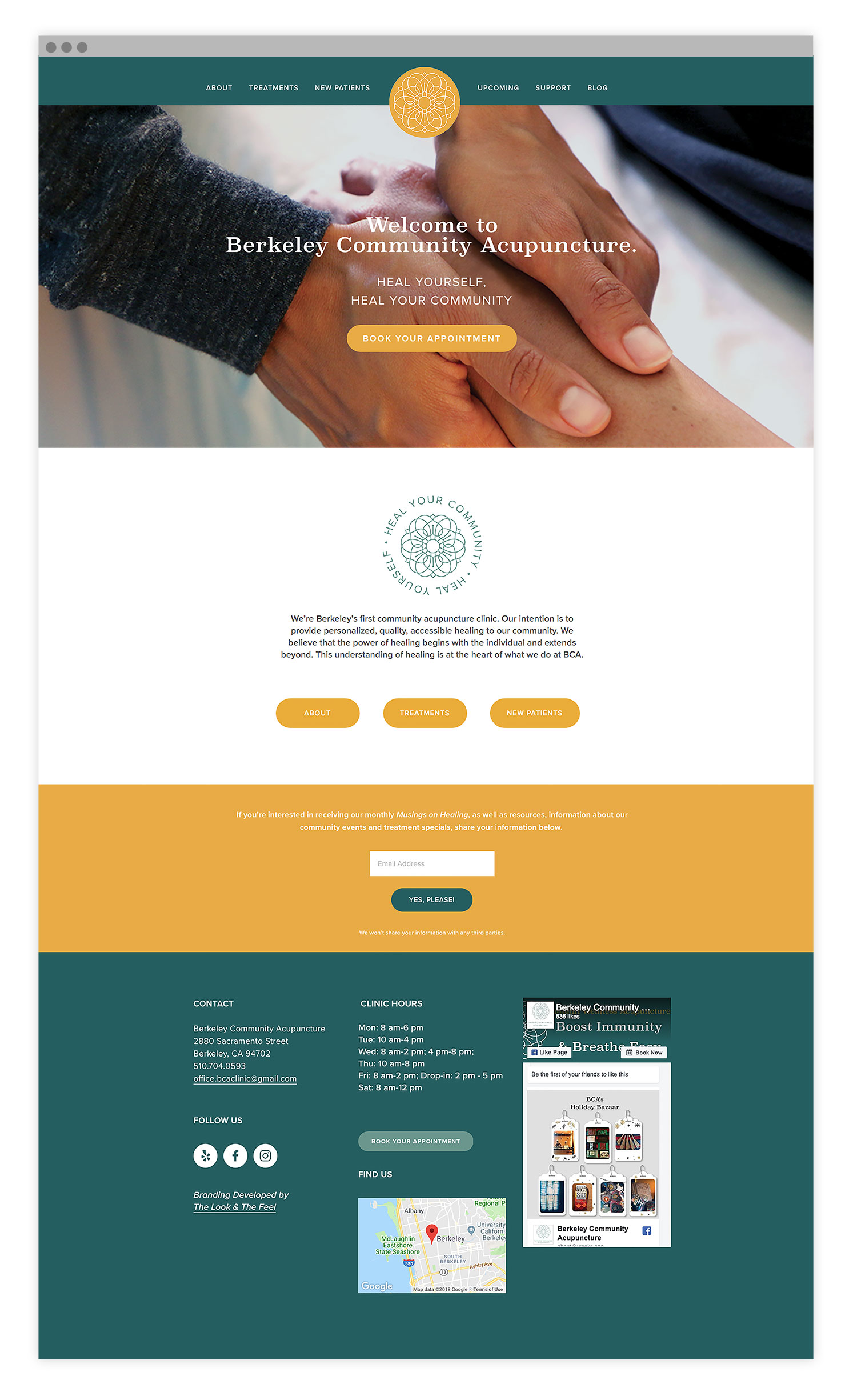
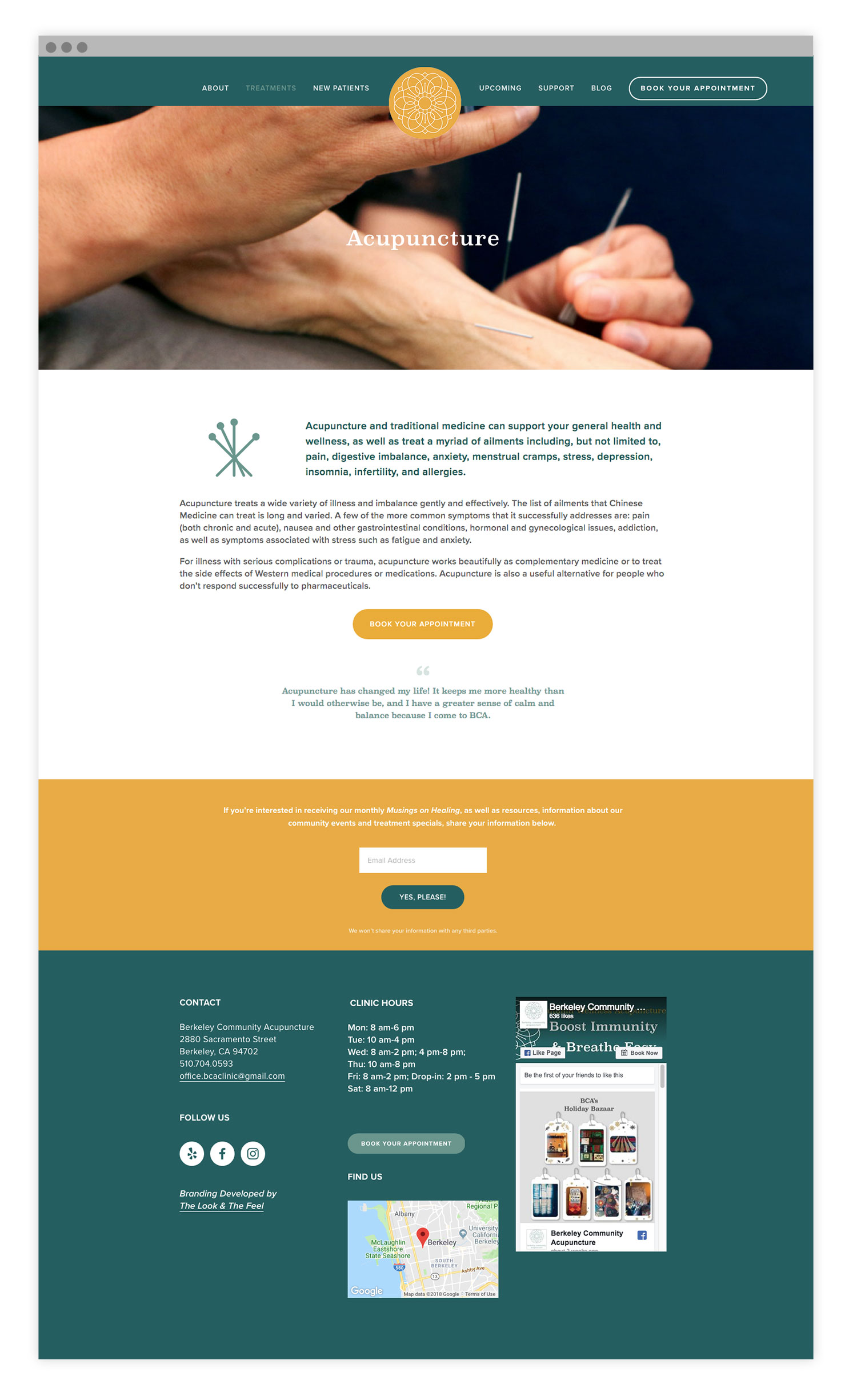
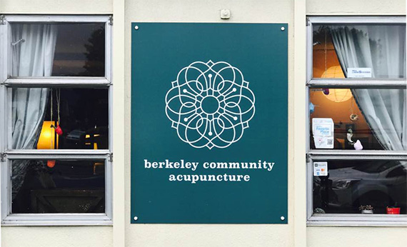
This project included a new logo design and a full website rebuild, including design and copywriting. We also created a full-color trifold brochure to showcase BCA’s services and offerings. Other pieces of collateral we created include a collection of business cards, an A-Frame sign, and social media banner graphics.
Our Approach
BCA came to us with an idea to create a logo that represented a feeling of movement and momentum; they wanted a dynamic design that didn’t feel static or stale. BCA also wanted the new look to feel playful, contemporary, but with a nod to the traditional roots of Chinese medicine.
They were interested in the sacred geometry of mandalas, with an emphasis on heart shapes. We drew inspiration from ocean elements and other mandala patterns and set to work to make this vision a reality. We arrived at the final logo, which is comprised completely of a series of intertwined hearts (and punctuated with acupuncture needles!) that are formed into a beautiful mandala shape. We used a rich, jewel-toned color palette that is both cheerful and calming. As for the website redesign, we aimed to focus on creating a very user-friendly layout, so the visitor can easily learn about BCA’s offerings, book an appointment, register for an event, or signup to volunteer. We also created the BCA blog, which serves as a catalog of wellness information as well as a forum for community discussion.
We love the rich warmth of BCA’s new look and feel. We hope that it makes you feel joyful and at ease, too.
“It’s magic. Easy. Fun. Beautiful. On point. I couldn’t be happier.”
— THUY NGUYEN, OWNER OF BCA
Do you have an acupuncture or wellness brand that needs a solid brand identity?
Reach out to us here to connect about how we can make your brand shine!


